Exploratory Data Analysis of COVID-19
Complete EDA of the COVID-19 dataset with notebook and interactive dashboard for data analysis.
Introduction
COVID-19 has been one of the greatest health and social crises of our time. To better understand the magnitude of this pandemic and make informed decisions, it is essential to conduct an Exploratory Data Analysis (EDA). We will explore the EDA process of COVID-19 step by step, using tools and techniques to visualize, analyze, and understand the data related to the spread of the virus in different countries.
1. Importing libraries and loading the dataset
We begin our EDA process by importing the necessary libraries, such as pandas, matplotlib, seaborn, and numpy. Then, we load the dataset in CSV format using the read_csv function from the pandas library. Next, we perform data cleaning, removing columns that do not provide relevant information for our analysis.
2. Filtering data by country
To conduct a more specific analysis, we select a particular country. In our case, we choose Chile as an example. We filter the dataset's data according to the selected country and create a new dataframe to work with.
3. Data analysis and visualization
At this stage of the process, we dive into data analysis and visualization. Using line charts, we analyze and visualize features such as new cases, new deaths, positivity rate, ICU patients, and vaccinated individuals over a timeline from the beginning of the pandemic to the present. Additionally, we calculate correlations between variables and create a heatmap to better understand the relationships among the selected features.
4. Exporting the dataset
Once the data cleaning and column selection stage is complete, we export the new dataset for use in interactive analyses with tools like Plotly. This allows us to generate more interactive and engaging visualizations for the user.
5. Using the Plotly library
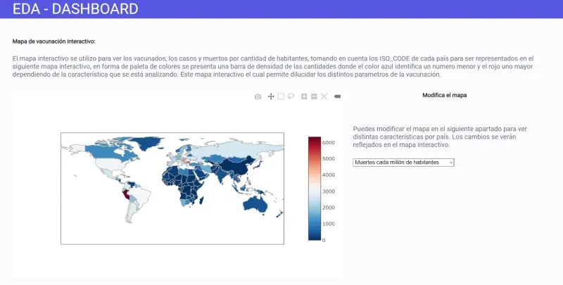
Finally, we use the Plotly library to create interactive visualizations. By utilizing specific functions, we generate bar charts comparing different features, such as the number of cases between two countries. We also create a world map that displays COVID-19 statistics in different countries using a color-coding scheme.
Conclusions
The Exploratory Data Analysis of COVID-19 is a powerful tool that allows us to better understand the spread of the virus and make informed decisions. Through data visualization and correlation calculations, we can identify patterns, trends, and relationships among different variables. The use of libraries like Plotly enables us to create interactive visualizations that facilitate user comprehension of the data.
Here is the PDF
- Here you can find a PDF of the page for you to read the report. Link to PDF